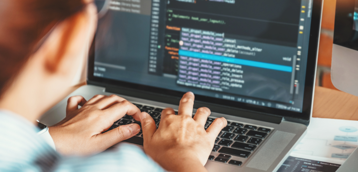
Web design is an ever-changing field that requires constant updates to stay competitive. As we approach 2024, several innovative trends are emerging that will shape the digital landscape. These trends include minimalist design, which emphasizes simplicity and usability; dark mode, which offers aesthetic and practical benefits; and metamorphism, which blends realism with simplicity.
Additionally, the rise of micro-interactions, 3D elements, and augmented reality (AR) enhances user engagement. Voice user interfaces (VUI) and sustainable web design practices are also gaining traction. Embracing these trends will ensure your website remains modern, engaging, and user-friendly, helping you stay ahead of the curve.
The Evolution of Web Design
A Brief History
Web design has significantly evolved since the early days of the Internet. Initially, websites were simple, text-based pages with minimal formatting and essential hyperlinks. Over time, the field advanced to incorporate images, videos, and interactive elements, transforming websites into rich multimedia experiences.
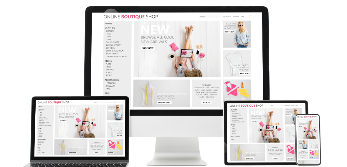
This evolution has been driven by advancements in technology and users’ changing needs and expectations. Today, web design focuses on creating user-centric, responsive, and visually appealing sites that function seamlessly across various devices. Continuous innovation in web design ensures that websites are aesthetically pleasing, highly functional, and engaging.
Recent Shifts and Innovations
In recent years, web design has shifted towards a user-centric approach, prioritizing accessibility, speed, and mobile responsiveness. This change reflects a growing awareness of users’ diverse needs, ensuring that websites are usable by people with disabilities and perform well on various devices. The emphasis on speed improves user experience and search engine rankings, while mobile responsiveness ensures seamless functionality across smartphones and tablets.
Technological advancements, such as faster internet speeds and powerful web development tools, have enabled designers to implement these principles effectively. Additionally, evolving design philosophies focusing on simplicity and user engagement have paved the way for new trends like minimalist design, dark mode, and augmented reality. These innovations create more intuitive, efficient, and engaging web experiences, keeping pace with the dynamic digital landscape.
Minimalist Design
Why Less is More
Minimalist design remains a prominent trend in 2024, emphasizing simplicity, reduced clutter, and enhanced usability. This design philosophy operates on the principle that “less is more,” advocating for removing unnecessary elements to create a clean, focused, and engaging user experience. By eliminating distractions, minimalist design helps users navigate websites more intuitively, highlighting essential content and functions.
Key features include clean layouts, ample white space, and straightforward typography, all contributing to a visually appealing and user-friendly interface. This approach improves the aesthetic appeal and enhances performance by ensuring faster load times and better mobile responsiveness. Overall, minimalist design prioritizes functionality and clarity, making it a favored choice for modern web design in 2024.
Key Features of Minimalism
Clean Layouts
Minimalist designs feature clean, straightforward layouts that effectively guide the user’s eye, making navigation intuitive. These designs highlight essential elements by focusing on simplicity and reducing visual clutter, ensuring users can easily find and interact with content. Key aspects include ample white space, simple typography, and a clear information hierarchy.
This approach enhances the aesthetic appeal and improves usability, making the website more engaging and user-friendly. Minimalist designs prioritize clarity and functionality, providing a seamless and efficient user experience.
Ample White Space
White space, also called negative space, is vital in minimalist design. It creates a sense of openness and allows content to breathe, preventing a cluttered look. Surrounding elements with ample space enhances readability and focus, guiding the user’s attention to critical information.
This strategic use of white space makes the design aesthetically pleasing and improves usability by making navigation more intuitive. White space is a fundamental component contributing to minimalist design’s clean, elegant, and efficient nature.
Simple Typography
Choosing the right typography is essential in minimalist design. Simple, readable fonts complement the clean, uncluttered aesthetic, enhancing visual appeal and readability. By using straightforward, legible typefaces, the design ensures that users can easily absorb content without distraction.
This focus on clarity and simplicity helps maintain the minimalist style, making the overall user experience more pleasant and efficient. Effective typography in minimalist design supports the aesthetic and is crucial in guiding the user’s eye and improving the website’s navigation.
Dark Mode Dominance
Benefits of Dark Mode
Dark mode’s popularity stems from its appealing aesthetics and practical advantages. Beyond its sleek appearance, it reduces eye strain, particularly in low-light environments, enhancing user comfort during extended browsing sessions. Additionally, it conserves battery life on devices with OLED screens by emitting fewer pixels.
This combination of visual appeal and practical benefits has made dark mode a sought-after feature in digital interfaces. Many users prefer it for its stylish look and contribution to a more comfortable and energy-efficient browsing experience.
Implementing Dark Mode in Your Design
Integrating dark mode into your design involves utilizing CSS variables or JavaScript toggles, allowing users to switch between light and dark themes. CSS variables allow for easy adjustment of color schemes, while JavaScript toggles enable dynamic theme switching based on user preferences.
This implementation ensures accessibility and caters to varying user preferences for brightness and visual comfort. By offering a choice between light and dark modes, designers enhance user experience and accommodate individual preferences, contributing to a more inclusive and customizable design approach.
Neumorphism
The Blend of Skeuomorphism and Flat Design
Neumorphism merges the realism of skeuomorphism with the simplicity of flat design, resulting in both lifelike and minimalist interfaces. This trend employs subtle shadows and highlights to produce a soft, extruded plastic effect on UI elements, giving them depth and dimension. Unlike skeuomorphism, which often replicates real-world textures and materials, neumorphism focuses on creating a visually appealing but simplified representation.
By incorporating gentle shadows and highlights, neuromorphic designs offer a tactile and engaging user experience without overwhelming users with excessive detail. This approach balances realism and minimalism, enhancing the aesthetics of digital interfaces while maintaining usability and clarity. Neumorphism represents a contemporary design trend that adds depth and sophistication to UI elements, contributing to a visually appealing and user-friendly interface design.
Applications and Examples
Neumorphism enhances user engagement by adding a tactile feel to interactive elements such as buttons and cards. This design trend employs subtle shadows and highlights to create a soft, extruded plastic effect, giving these elements a three-dimensional appearance. As users interact with neuromorphic elements, they experience a sense of depth and texture, mimicking the tactile feedback of physical objects.
This tactile quality enhances the interface’s visual appeal and encourages users to engage more actively, contributing to a more immersive and enjoyable user experience. Overall, neumorphism’s ability to add depth and tactility to interactive elements makes it a compelling choice for enhancing user engagement in digital interfaces.
Micro-Interactions
Enhancing User Experience
Micro-interactions are subtle, functional animations within a website that guide users and offer feedback. These small animations, such as button hover effects or form validation indicators, create a sense of interactivity and vitality. By responding to user actions, micro-interactions enhance user engagement and make the website feel dynamic and responsive.
Whether a subtle animation confirming a successful action or a visual cue indicating an error, these micro-interactions improve the overall user experience by providing clear feedback and guiding users through various interactions. Ultimately, they contribute to a more engaging and enjoyable browsing experience, increasing user satisfaction and retention.
Types of Micro-Interactions
Button Animations
Animated buttons that respond to user clicks or hover interactions offer a satisfying user experience. These dynamic elements provide immediate visual feedback, confirming user actions and enhancing interactivity. Whether it’s a subtle change in color, a brief animation, or a transition effect, these animations engage users and make interactions more engaging.
Animated buttons improve usability and contribute to a sense of dynamism and excitement within the interface by adding a layer of responsiveness. Overall, they elevate the user experience by creating a more interactive and visually stimulating environment, encouraging continued engagement with the website.
Hover Effects
Hover effects dynamically highlight elements as the user’s cursor passes over them, enhancing navigation and engagement. These effects, ranging from color changes to animations, provide immediate visual feedback, guiding users’ attention and indicating interactive elements. By visually differentiating clickable or hoverable areas, hover effects make navigation more intuitive and user-friendly.
They also create a more interactive and immersive browsing experience, encouraging users to explore and engage with the content. Overall, hover effects are crucial in improving user experience by facilitating navigation, increasing engagement, and enhancing the website’s overall usability.
Scroll Animations
Scroll animations introduce a dynamic dimension to the user’s scrolling experience, unveiling content in a visually engaging manner as they navigate through the page. These animations trigger as the user scrolls, revealing elements such as images, text, or graphics, adding interest and interactivity.
Scroll animations captivate users’ attention by animating content as it comes into view, encouraging them to explore further and stay engaged with the page. This dynamic storytelling technique enhances user experience and adds a layer of excitement and immersion to the browsing journey, making it more enjoyable and memorable.
3D Elements and Illustrations
Adding Depth and Realism
Incorporating 3D elements and illustrations into a website can transform it into a captivating and immersive digital environment. By introducing depth and a sense of realism, these elements engage users on a deeper level, drawing them into the content and enhancing their overall browsing experience. Whether it’s a three-dimensional product showcase, an interactive virtual tour, or a dynamic animated scene, 3D elements create visual interest and intrigue.
They provide a sense of tangibility and spatial awareness that traditional 2D graphics cannot replicate, making the website more interactive and lifelike. As users interact with these elements, they feel a greater sense of presence and engagement, fostering a stronger connection to the content. Ultimately, integrating 3D elements and illustrations adds depth and immersion to the website, enriching the user experience and leaving a lasting impression.
Tools and Techniques
Tools such as Blender and three.js streamline the process of creating and incorporating 3D elements into web design. Blender is a powerful open-source 3D creation suite offering a wide range of modeling, animation, and rendering features. On the other hand, three.js is a lightweight JavaScript library that simplifies the integration of 3D graphics into web pages, providing developers with a robust framework for building interactive 3D experiences.
By leveraging these tools, designers and developers can quickly bring their creative visions to life, adding immersive 3D elements to websites without extensive coding or complex software. This accessibility democratizes 3D design, enabling a more comprehensive range of websites to incorporate engaging and visually stunning 3D content.
Voice User Interface (VUI)
Rise of Voice Search
As smart speakers and voice assistants become ubiquitous in households and mobile devices, designing for voice interactions is rapidly gaining significance. Voice technology has revolutionized how users interact with technology, offering hands-free convenience and accessibility. Designing for voice interactions involves creating intuitive and efficient user experiences seamlessly integrating spoken commands and responses. This requires a deep understanding of natural language processing, user behavior, and context-aware computing.
Voice interfaces must be designed to accurately understand various accents, speech patterns, and user intents. Furthermore, designers must consider the context in which users engage with voice assistants, ensuring that interactions are contextually relevant and meaningful. By prioritizing voice interaction design, businesses can enhance accessibility, improve user engagement, and stay ahead in the evolving landscape of digital experiences.
Designing for Voice Interactions
Designing a Voice User Interface (VUI) necessitates considering how users will engage with your website through voice commands. This entails ensuring that navigation and functionality are intuitive and accessible to users of varying abilities and preferences. VUI design involves crafting conversational experiences that mimic natural human dialogue, allowing users to interact with the website seamlessly and intuitively.
This requires understanding user intent, context, and potential conversational paths to effectively anticipate and respond to user queries. Additionally, designers must account for different accents, speech patterns, and language nuances to accurately interpret voice commands. By prioritizing VUI design, websites can offer a more inclusive and user-friendly experience, empowering users to navigate and interact with the site effortlessly using their voice.
Augmented Reality (AR) Integration
Enhancing User Engagement
Augmented Reality (AR) can potentially revolutionize web design by introducing a heightened level of interactivity. By superimposing digital content onto the physical world through a user’s device camera, AR enables immersive experiences that blend virtual and real environments seamlessly. This technology allows websites to offer users interactive features such as virtual try-ons for products, 3D visualizations of objects in real-world settings, or interactive games and experiences.
AR enhances user engagement by providing novel and captivating interactions that transcend traditional web design boundaries. Furthermore, it enables users to visualize products or experiences in a more realistic context, leading to more informed purchasing decisions and a deeper level of engagement with the content. Overall, AR empowers web designers to create dynamic and memorable experiences that captivate and delight users.
Examples of AR in Web Design
AR examples in web design include virtual try-ons for e-commerce and interactive product demonstrations. In virtual try-ons, users can visualize how products like clothing or accessories will look on them by overlaying digital representations onto their images.
Interactive product demonstrations allow users to explore products in 3D, rotate them, and view them from various angles, enhancing the shopping experience. These applications of AR leverage immersive technology to provide users with engaging and informative experiences, ultimately facilitating better decision-making and driving user engagement and satisfaction on e-commerce websites.
Custom Cursors and Mouse Effects
Personalizing User Experience
Custom cursors and mouse effects offer a distinctive way to elevate a website’s visual appeal and interactivity. By replacing the standard cursor with a customized design or implementing mouse effects such as hover animations or trails, web designers can create a more engaging and memorable user experience. These elements add a touch of personality and creativity to the website, making it stand out from competitors and leaving a lasting impression on visitors.
Custom cursors and mouse effects can also serve as visual cues, guiding users’ attention to the site’s essential elements or interactive areas. By enhancing the overall aesthetics and usability, these design choices contribute to a more immersive and enjoyable browsing experience, ultimately fostering increased user engagement and satisfaction.
Creative Cursor Designs
Custom cursor designs, ranging from animated cursors to shape-changing effects, inject an element of surprise and delight into the browsing experience. These unique visual elements captivate users’ attention and evoke a sense of curiosity and intrigue as they explore the website. By deviating from standard cursor conventions, custom designs create a memorable and engaging interaction, enhancing the overall user experience.
Whether a playful animation or an unexpected transformation, custom cursors add a touch of whimsy and personality to the website, leaving a positive impression on visitors and encouraging them to further engage with the content.
Sustainable Web Design
Eco-Friendly Practices
Sustainable web design prioritizes minimizing the environmental footprint of websites by adopting eco-friendly practices throughout the design and development process. This encompasses various strategies, such as optimizing images to reduce file sizes, minimizing data transfer, and reducing energy consumption and carbon emissions associated with website loading. Additionally, sustainable web design involves selecting green hosting services powered by renewable energy sources, further reducing the carbon footprint of hosting operations.
Moreover, designers strive to minimize resource use by employing efficient coding practices and avoiding excessive bandwidth-intensive features. By incorporating these sustainable practices, websites can significantly reduce their environmental impact while delivering high-quality user experiences. Sustainable web design not only benefits the planet but also aligns with the values of environmentally conscious users, enhancing the overall reputation and credibility of the website.
Benefits of Sustainability
Sustainable practices in web design offer benefits beyond environmental considerations, including improvements in site speed and user experience. Optimizing images and minimizing resource use can significantly reduce website loading times, resulting in faster page load speeds. This enhanced performance contributes to a smoother and more seamless browsing experience for users, reducing bounce rates and increasing engagement.
Moreover, search engines favor faster-loading websites, potentially improving their rankings and visibility. As a result, sustainable web design benefits the environment and positively impacts user satisfaction and website performance metrics. By prioritizing sustainability, web designers can create websites that are not only eco-friendly but also deliver superior user experiences, ultimately enhancing the overall success and effectiveness of the site.
Asymmetrical Layouts
Breaking the Grid
Asymmetrical layouts defy the conventions of traditional grid-based designs, introducing dynamism and visual intrigue. Unlike structured grid layouts, asymmetrical designs feature irregular arrangements of elements, creating a sense of movement and spontaneity. This departure from uniformity adds visual interest and uniqueness to the layout, captivating users’ attention and encouraging exploration.
Asymmetrical layouts allow for greater creativity and flexibility in design, enabling designers to craft visually striking compositions that stand out from the crowd. By breaking free from the constraints of rigid grids, asymmetrical layouts offer a fresh and dynamic approach to web design, enhancing the overall user experience with their innovative and captivating aesthetic.
Visual Interest and Engagement
Asymmetrical layouts have a distinct ability to capture attention and engage users more effectively compared to symmetrical designs. The irregular arrangement of elements in asymmetrical layouts creates visual interest and curiosity, prompting users to explore further. This dynamic composition fosters a sense of excitement and intrigue, encouraging prolonged engagement with the website.
Unlike symmetrical layouts, which may appear predictable or static, asymmetrical designs offer a fresh, unconventional aesthetic that resonates with modern users. By leveraging the inherent asymmetry, web designers can create visually compelling experiences that captivate users’ attention and leave a lasting impression.
Advanced Typography
Custom Fonts
Custom fonts offer the opportunity for unique branding and differentiation, setting your website apart from competitors. By selecting distinctive typefaces that align with your brand identity, you can create a memorable and cohesive visual experience for users. Custom fonts convey personality, style, and professionalism, reinforcing brand recognition and leaving a lasting impression on visitors.
Unlike standard web fonts, commonly used across various websites, custom fonts provide exclusivity and authenticity, enhancing your website’s overall uniqueness and appeal. Ultimately, leveraging custom fonts allows you to establish a strong brand presence and stand out online, attracting and retaining users with a visually distinctive and memorable design.
Variable Fonts
Variable fonts provide design flexibility, enabling responsive typography that adapts to diverse screen sizes and orientations. With variable fonts, designers can dynamically adjust characteristics like weight, width, and slant, ensuring optimal readability and aesthetics across various devices and viewing conditions.
This versatility streamlines the design process, eliminating the need for multiple font files and simplifying typography management. By harnessing the power of variable fonts, websites can deliver consistent and visually appealing typography experiences, enhancing user engagement and satisfaction across different platforms and devices.
Integration of AI and Machine Learning
Personalized User Experiences
AI and machine learning technologies analyze user behavior to deliver personalized experiences, from tailored content recommendations to adaptive user interfaces. By analyzing user interactions and preferences, these systems can dynamically adjust website content, layout, and functionality to match individual user needs and preferences. This personalized approach enhances user engagement and satisfaction by delivering relevant and meaningful experiences.
Additionally, AI-powered algorithms continually learn from user interactions, refining recommendations and adaptations over time to further optimize the user experience. Ultimately, leveraging AI and machine learning enables websites to provide highly personalized and engaging experiences that cater to each user’s unique preferences and behaviors.
AI Tools for Web Designers
Tools such as Adobe Sensei and Figma’s AI integrations revolutionize design workflows by automating tasks and unlocking innovative creative opportunities. Adobe Sensei leverages artificial intelligence to automate repetitive tasks, analyze data, and generate insights, allowing designers to focus on creative decision-making. Similarly, Figma’s AI integrations facilitate collaboration and design iteration by providing intelligent suggestions and automating tedious processes.
By harnessing the power of AI, designers can streamline their workflows, accelerate project timelines, and explore new creative avenues that were previously inaccessible. These tools empower designers to push the boundaries of creativity and efficiency, ultimately enhancing the quality and impact of their design work.
Conclusion
In today’s rapidly evolving digital environment, staying abreast of web design trends is essential for maintaining a competitive edge. Embracing the top trends for 2024 ensures that your website remains relevant, engaging, and user-friendly. From minimalist designs and dark mode to augmented reality (AR) integration and AI-driven personalization, these trends present exciting opportunities to elevate your web presence. Minimalist designs emphasize simplicity and usability, while dark mode enhances aesthetics and reduces eye strain.
AR integration offers immersive experiences, and AI-driven personalization tailors content to individual user preferences. By incorporating these trends into your web design strategy, you can captivate your audience, improve user experience, and stay ahead of the curve in the dynamic digital landscape 2024.
FAQs
What is the most crucial web design trend in 2024?
It’s hard to pinpoint just one, but the minimalist design is very influential due to its focus on usability and simplicity.
How can I implement dark mode on my website?
You can implement dark mode using CSS variables or JavaScript toggles, allowing users to switch between light and dark themes.
Why is minimalist design so popular?
Minimalist design is popular because it enhances usability by reducing clutter and focusing on essential elements, creating a clean and engaging user experience.
What are micro-interactions, and why are they important?
Micro-interactions are small animations providing feedback and guiding users, making a website feel more interactive and improving the overall user experience.
How does augmented reality enhance web design?
AR enhances web design by adding a layer of interactivity and engagement, allowing users to interact with digital content in a real-world context, which can be especially useful for e-commerce and product demonstrations.
